
Picking paint feels simple until you’re standing in the store staring at forty shades of “off-white” wondering which one is actually right. Learning how to choose paint colors properly isn’t about personal taste alone — light, room size, and function all play a real role in what actually works once it’s on the wall.
I’ve made the mistake of picking a color purely from a small swatch and regretting it once it covered an entire wall. That mistake taught me more than any color theory book could.
Start With the Room’s Natural Light
Direct answer: North-facing rooms with cooler, dimmer natural light generally pair better with warm paint tones to balance the coolness, while south-facing rooms with strong sunlight can handle cooler tones without feeling cold.
Always test paint swatches on the actual wall at different times of day — morning light and evening light change how a color reads dramatically, sometimes more than the color itself.
Consider the Room’s Function
Different rooms benefit from different color psychology:
- Bedrooms: softer, muted tones (blues, greens, warm neutrals) support relaxation
- Kitchens: warmer tones or crisp whites tend to feel energizing and clean
- Living rooms: flexible — depends on whether the space is meant for socializing (bolder) or relaxing (calmer)
- Home offices: cooler tones like soft blue or green can support focus better than very warm shades
Small Rooms Need Different Treatment Than Large Ones
Direct answer: Light, cool-toned paint colors generally make small rooms feel more open, while darker or warmer shades tend to make large rooms feel cozier and more grounded rather than cavernous.
That said, this isn’t an absolute rule — a small room in a rich, dark color can look genuinely striking if lighting is planned well. It’s just a riskier choice than sticking with lighter tones.
The 60-30-10 Rule
A reliable, simple framework when learning how to choose paint colors for a whole space: 60% dominant color (usually walls), 30% secondary color (furniture, curtains), and 10% accent color (decor, cushions, art). This keeps a room feeling coordinated without looking flat or overly matched.
Testing Before Committing
Never trust a paint chip alone. Buy a small sample pot, paint a section directly on the wall (not on paper — actual wall texture affects how color reads), and observe it across a full day before finalizing. This one step prevents most regretted paint decisions.
Popular Color Directions for 2026
- Warm, earthy neutrals continuing to dominate over stark whites
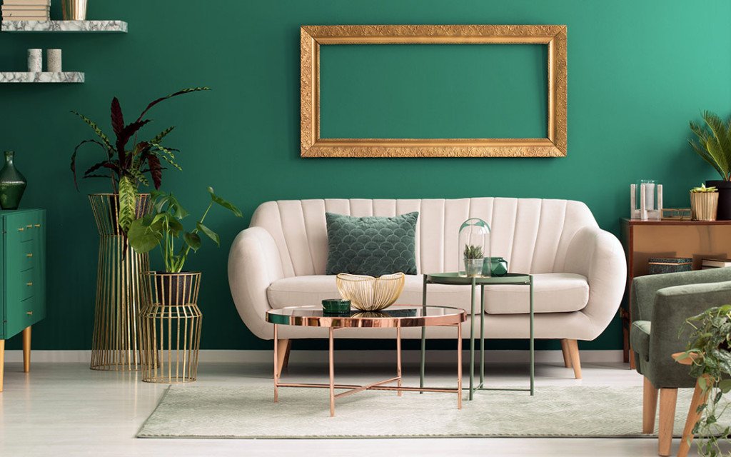
- Sage and muted greens remaining popular for bedrooms and living spaces
- Deep, moody colors used selectively as accent walls rather than whole-room applications
- Warm off-whites replacing cooler, clinical whites in most spaces
Undertones Matter More Than the Main Color
Direct answer: Every paint color has an undertone — a subtle secondary hue — and mismatched undertones between walls, flooring, and furniture is one of the most common reasons a “correct” color choice ends up looking off once applied.
A white with a yellow undertone against cool grey flooring, for instance, often looks slightly dirty rather than clean, even though both are technically neutral colors on their own.
Coordinating Across Connected Spaces
For open-plan homes or spaces with visual flow between rooms, colors don’t need to match exactly, but they should feel like they belong to the same overall palette. Jarring transitions between adjacent rooms can make a home feel disjointed rather than intentional [link to related guide about interior design trends 2026 here].
Common Mistakes When Choosing Paint Colors
- Choosing colors under store lighting instead of testing at home
- Ignoring how the color will look next to existing furniture and flooring
- Going too bold on all four walls instead of starting with one accent wall
- Forgetting that paint colors often look 1-2 shades darker once applied to a full wall compared to the swatch
FAQ
Q: How do I choose paint colors for a room with little natural light? Lean toward warmer, lighter tones — these help compensate for the lack of natural brightness better than cool or dark shades.
Q: Should all rooms in a house use the same color palette? Not necessarily the same colors, but a cohesive palette with complementary undertones creates better visual flow throughout the home.
Q: How many paint samples should I test before deciding? Testing 2-3 shortlisted shades directly on the wall gives a realistic comparison; testing too many at once tends to cause decision fatigue.
Q: Do dark colors always make rooms feel smaller? Generally yes, though good lighting and minimal furniture can offset this, making a dark room feel intentional rather than cramped.
Q: What’s a safe paint color choice if I can’t decide? Warm neutrals — soft beige, warm greige, or off-white — are the safest, most broadly appealing choices across most rooms and lighting conditions.
Conclusion
Learning how to choose paint colors properly comes down to testing on the actual wall, considering the room’s light and function, and paying attention to undertones rather than picking based on the swatch alone. Take the extra week to sample colors properly before committing — repainting an entire room because of a rushed decision costs far more time and money than testing upfront.
Suggested Alt Text:
- “Paint swatches being tested on living room wall”
- “Warm neutral paint color applied to bedroom wall”
- “Color palette samples arranged next to furniture fabric”